I was so excited when Lindsay and Lindsay asked
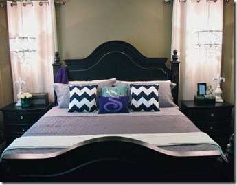
Hyphen Interiors to participate in their "Favorite Room Feature” series. Of course, like most people, I chose my most recent room to be completed – my master bedroom. A fair warning: there is a lot of rule breaking in this room. And, this is a long post.
I know that doesn’t look THAT different at first glance, but trust me, it is… You’ll be able to see more in photos below. But, first, I want to talk you through the thought process, and design process.
We had neglected our master for a year after moving into our new home. We knew we wanted to be able to watch TV from the bed (when we are sick) or from a sofa (when we are quietly chilling upstairs and overnight guests are downstairs). But, we couldn’t get our mind around how to arrange the room in order to make that possible. So rather than solving the dilemma, we just did other rooms first. Finally, it was time to tackle the master bedroom.
The room is 13.5 x 19 ft. The way the hall is, it makes you enter almost at an angle.
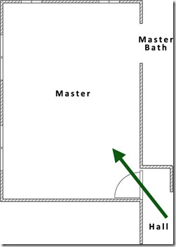
I know that traditional design rules would say to put the bed on the opposite wall from the door. While I think rules are there for a reason, I only consider them to be guidance and to help you know when it’s appropriate to break them. In this case, there were a few reasons why I didn’t put the bed on the opposite wall.
- You technically enter at an angle making two walls appropriate.
- The shorter wall had reading lights (can lights) for over the bed.
But, the main reason for not placing the bed on the opposite wall as the door was the use of the room.
The way a client (or yourself) uses a room is of the utmost importance when designing a space.
We wanted to use this room not only for sleeping, but also for a retreat.
So, we planned to break our former rule of no TV in a bedroom and put one in, while also making it visible from the bed and sofa. One thing that was for sure was that the TV needed to go on the wall with the door so it was not a focal point.
Having the bed on that opposite wall would essentially break the room in half (see below), and would not allow for the room to serve the purpose I just described.


After considering our needs, the room measurements, our furniture, and so on, we tried a number of options, which I will not bore you with. We decided on this floor plan, which happens to be the way the builder designed it. The TV would sit on the chest of drawers on the right wall, and would swivel.
So, now, we were over the floor plan hurdle and were on to the design. I went straight to
story board making. We wanted to create an artistic, yet cozy and luxurious feel.
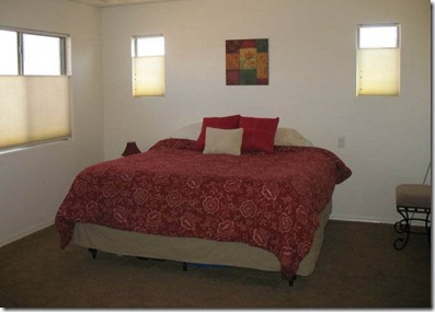
The original owners had the room like this when we viewed the house. Very uneventful.
Upon moving in, we immediately painted the walls a taupe color - Wild Hawk by Valspar. Then, we threw our stuff in and it looked like this. Not too great.
We decided to keep the furniture and blackout curtains. The curtains were new, soft, luxurious and neutral. The furniture was neutral and up to date. They gave a great backdrop for some drama and color.
We came up with two schemes on story boards at first. Blue and yellow or blue and purple. Here are the original story boards, before changes were made.


In the end, we went against popular opinion and went with purple because it felt richer and more luxurious to us. Yellow felt more sunny – we decided to incorporate yellow into other rooms, but not the master.
One change that was made was in the lighting – we went from the striped purple barrel shade that you saw in the story board to the silver chandeliers below. Another change was in pillows. The final story board looked like this. It served as a visual guide.
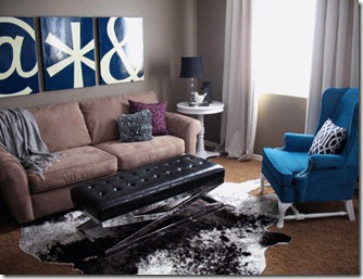
The sofa and mirror were items in the room. The chair, art, and solid pillows were inspirational and just a general idea of what we wanted in those regards.
The color scheme is navy, sage blue, purple, gray, black and white with a pop of teal. We added the navy to help anchor the space.
Let’s talk about some of the items on the story board.
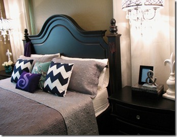
For night stand lighting, we didn’t do traditional lamps. We chose to free up the nightstand space and put
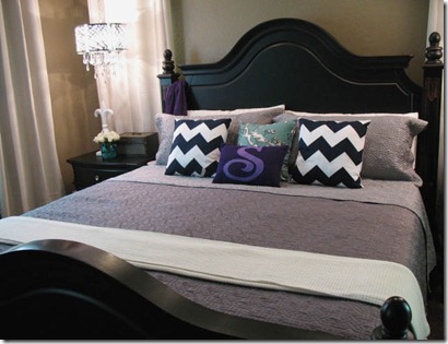
hanging chandeliers over them instead of the traditional lamps.
I love this choice as it adds a bit of bling to that side of the room, and certainly adds drama. They are beautiful fixtures from Overstock.
The art ended up more contemporary than the inspiration art on the story board, but was still blue and off-white. Just much more graphic. I
painted table tops from Pei Wei for the art.
I decided to hang a series of three over the bed in order to break up a large blank wall and add color and weight to that side of the room.
All of the
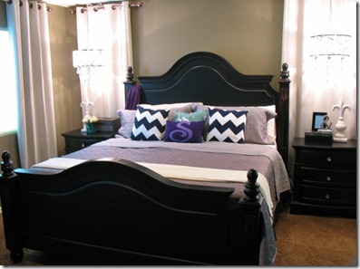
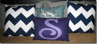
pillows on the bed were hand made by an etsy shop owner.
We ordered a faux
cow skin rug from Overstock to anchor the sofa and chair. We chose the cow skin not only due to the colors (dark brown and white) but also due to the organic shape. We didn’t want to square off that area.
We chose a
bench for an ottoman so that it was more narrow, was cushioned and could be used elsewhere for additional seating if ever needed.
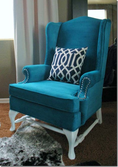
The big exciting thing on my blog has been the process of finding an old
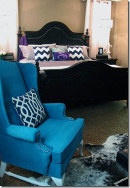
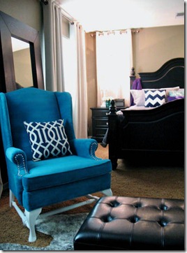
wing back chair on Craigslist and painting it! Yes, painting it, not re-upholstering it. This helped to keep costs down.
We used this chair as a pop of color and somewhat of a focal point in the room.
The pillow on it is a
trellis look alike pillow found at Target for $12. It’s navy and white, like the art and chevron pillows.
The purple was used sparingly on a pillow on the sofa, one pillow on the bed and a throw on the bed.
I chose the bedding because I wanted a less fluffy style of bedding; a quilt style. I also wanted a subtle color that didn’t draw a lot of attention. I chose a Thomas O’Brien gray quilt style bedspread from Target. Then, I accented it with pillows from etsy.
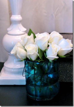
I put fresh roses on the night stand for some romance. They are in a blue glass vase to bring in some sage/ teal color. I mimicked that on the other nightstand with printable art in that color.
The
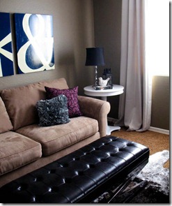
sofa is from Craigslist for $75 and so is the table. We painted the
round table glossy white. It was once black.
The
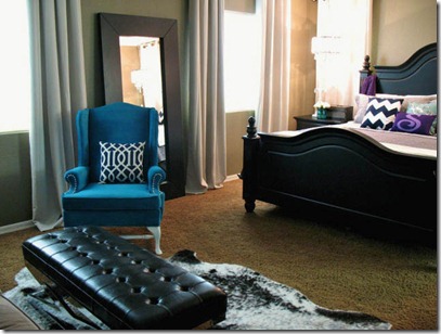
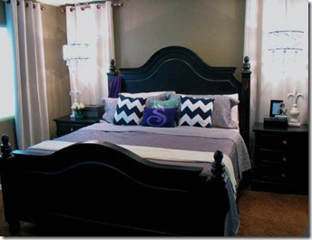
end product is below. I do apologize for the color being off in the photos and for the icky carpet. We do plan on replacing it, so I didn’t want to design around it.
I hope you enjoyed exploring my thought process with the room design. Right now, this is my favorite room.


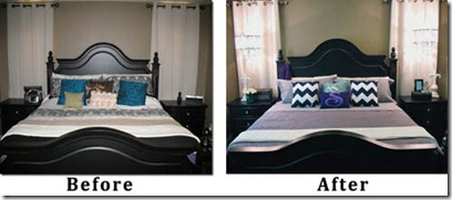




![IMG_4956 (480x640) (2)_thumb[3] IMG_4956 (480x640) (2)_thumb[3]](http://lh6.ggpht.com/_zlLTVlAb2do/TaMqbnoEhyI/AAAAAAAABAw/dFY5p3LZ1FU/IMG_4956%20%28480x640%29%20%282%29_thumb%5B3%5D_thumb%5B5%5D.jpg?imgmax=800)

![rug2._thumb[1] rug2._thumb[1]](http://lh5.ggpht.com/_zlLTVlAb2do/TWlA0W2-MnI/AAAAAAAAAGE/yPvVYGN7gdo/rug2._thumb%5B1%5D_thumb.png?imgmax=800)
![bench2._thumb[1] bench2._thumb[1]](http://lh4.ggpht.com/_zlLTVlAb2do/TWlA18i_6yI/AAAAAAAAAGM/U8ADStP2kv4/bench2._thumb%5B1%5D_thumb.png?imgmax=800)
